+5
Under review
Status and value of channels hides name in online mode
Hi,
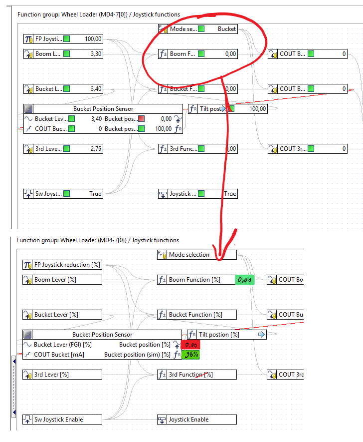
when an application is not so clear structurized like below, it becomes sometimes hard to understand an application. In online mode it gets worse, as the status covers the name.
Quite often the area behind a channel box is free and could be used to show the values and status in one field.
Let me know your thoughts.
rgds Arno

Customer support service by UserEcho

In IQANdesign channels can be moved around and placed close to or even overlapping each other. Therefore we decided to have fixed width on the channel controls, so the user should not have to leave extra room for the measure value.
However, as you mention, there is often empty space on the right side of the channel control. Maybe we could add an option, so the user can decide whether he/she wants the measured value inside or outside of the channel control?
Allowing to use long module for big project where name maters.